Wednesday, May 9, 2012

Drawing II: 45 Minutes

Spring 2012


Starting with a few quick Ink questures, Professor Burke allowed us to warm up before our first 45 minute pose, our longest pose yet. Professor Burke Stressed the importance of not only line gesturing but also 'mass gesturing' in which shading and not line is used to imply the figure. Dispite having such an extended period to draw, though, I fell short of timid and ended up with a sketch of a drawing. The shape recognition is good though, but without color, the shapes only flatten it. I only gaze at the picture wondering what it might have could have become with some more time.

Materials: 100 lb. Drawing Paper, Graphite Stick, Assorted Pencils, Acrylic

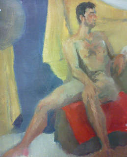
Drawing and Painting Marathon: out of Class Figure Study

Spring 2012

This just happens to be my first, from observation figure study in paint. I had actually painted figures only from imagination up to this point, and not that those studies were hidious, just that those were schemetized and shallow in depth. Even with such little knowlege and experience gained through Painting I, I was able to mostly successfully render some basis of the Human Forme. Overall, it does seem too high key in comparison to the rich hue and value ranges within the actual sight, it still reads as fleash without simply using flesh tone and in that aspect, it's some what successful.

Materials: Gessoed Bristol Board, Utrecht Oil Paints

4 D Design: Compisition [Music Video Concept]

Spring 2012
This is what I would call 'Proto-Animation,' More of a skeleton: to much to be a story board but not enough to be an animatic yet too subjective and stylized to be keyframes of anysort, just a concept. On the otherhand, as an animation student without a traditional animation course under hsi belt and windows movie maker on hand, I feel pretty gratisfied with this project, but excuses are still excuses.
I had recently watched the independent film 'Once' featuring Swell Season as the main cast and the compisition of all the music in the film and I especially couldn't get this song, Fallen From the Sky out of my noggin. Even peers got the song looped into their tierd brains during one viewing on critique day. The song is so cathy, my "room mate" gets it stuck in her head at the mee mention of this 'poto aniamtion.' Even though the song is almost edited in half; it, along with some witty metaphors and elating color schemes, is all you need to remember this protomation for all eternity, mwahaha!

Programs: Paint Tool Sai, Audacity [beta], Windows Movie Maker

Computer Animation: Run Cycle

Spring 2012
Steave Carpenter, the computer animation professor, held our hand through a walk cycle and then out of the blue assigned us a run cyle. I stuggled  to get the run correct but I realised I might have learned more doing on my own than when Steave taught the class. I assume he figured as such.
The run cycle was more or less the complete opposite the walk cycle in every way but mostly, the rig that parented everything to the hips was brutally honestly brutal. I did suprisingly good though I had the most trouble with timing and using a graph editor
but it was still an invaluable learnign experience that I'll remember in my nightmares.


Programs: Lightwave 10.1 [Modeler, Layout]

Painting I: Compromise

Spring 2012
After the previous 'Revelation'  in my painting and Drawing Courses, I got carried away with painting what I believe is there and only loosely painting from observation. I understand this is what most of the best artists do but until I reach that level, I shall continue to furiously observe to gain knowlege. I do believe that within this painting, the compromise between the two, what I know and what I see, are balanced well but as I said, observation and humility, a good student make.
 Materials:
   Gessoed Bristol Board
   Utrecht Oil Paints

Computer Animation: Adobe After Effects Title Sequence

Spring 2012
Adobe After Effects is like being bitten by one of fifteen super spiders, even if it takes just as long to open the program as it does to transform into spiderman. The program is ideal for the mixed media or 2D and 3D animation and I know I'll be using it much more often. This is the title sequence of out final animatic that we will do. I assume I shall alter it as the final comes up but until our final comes up, this is satisfactory.

Programs: Adobe Photoshop, Adobe After Effects

Painting I: Limited Pallet [Revelation]

Spring 2012
Painting had continued to frustrate me into our adventure into the depth of color. The class worked through a limited pallet of first ultramarine, burnt sienna and white to now those same three oil pigments plus yellow ochre to achieve temperature and muted hue variation on top of our already comprehensive value experiences. Once Richard's lectures of relationships sunk in, I understood what painting was, not what you saw exactly, but portraying what you saw through ones art. I had done it in Katie Waugh's Reveal, 4D Design Project-Steven Carpenter, the Computer Animation Professor, continually said the same about animating and drawing was deffinitly not reality; then why should painting be either? Not to mention my brush work improved a great deal in this painting as well-

Materials: Gessoed Bristol Board, Utrecht Oil Paints

Drawing II: Gestures [Revelation]

Spring 2012
Rachael Burke, the Drawing II Professor, went more quickly into figure drawing than Sulpy, my Drawing I Professor, but I mangaged well. Burke Typically ahd us sketch gestures starting with a class of 1 to 2 to 5 minute gestures to a day of 'Geometric Reduction.' The concept seemed to correlate well with the Modeling thought process in Computer Animation. The last day we had to do shorter poses ranging from 5 to 30 minute poses, I had a revelation. Cross hatching or showing line work seemed so unfinished and undesirable to me at first but it came through to much pleasure in the 25 minute pose below. If a painting could include their brushstokes, then so could a drawing include pencil strokes [I know, not new in general but new to me]


Materials:
   Drawing Paper
   Graphite Sticks
   Assorted Pencils
   Charcoal

4 D Design: Reveal Video

Spring 2012
The criteria of this video project was to create a situation with a suprising or shocking reveal, be it humorous or frightening or anything inbetween i suppose. By using various, and confusing shots that showed clear decerable form, people were led on to beleive what they saw was something ... else? Well, I Wouldn't want to spoil the suprise, now would I?
On a more objective topic, windows movie maker was an extremely poor choice for video editing but unfortunatly it was all I had on hand; that and a cell phone with a video camera with the resolution of a newborns eyesight, but I don't believe this hindered my concept all too much. On the other hand, the Audio editing eperience was the invaluable and Audacity, even in its beta version, was easy to grasp, handel, and maneuver when editing my diagetic noise.

Equipment: Cell Phone [Video recorder]
Programs: Audacity [beta], Windows Movie Maker

Tuesday, May 8, 2012

Computer Animation: Ball Bounce


Spring 2012
My first rendering in Steave Carpenter's, Compter Animation Course. Not my strogest subject but I definitly feel out of my comfort zone and that is always the key to learning: being on the brink of failure.
Our class bounced a ball, that's it. Quite different than what I expected but ended up pretty simple once an understanding was found.
Programs:
    Lightwave 10.1 [Modeler, Layout]
    Adobe After Effects

Drawing II: Sensitive Contour

Spring 2012
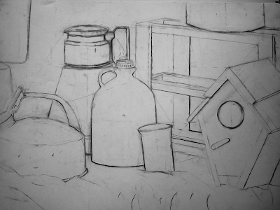
Professor Burke had beaten whatever composing and siting issues the students had out of their system. Even though I felt confident from my Drawing I experience, it was a good wake up call. especially since the vine charcoal stained to paper and made erasing quite messy. This is my most succesful sensitive contour piece by far because of its meticulous siting but a still life will always be Dead Nature in my eyes.

Materials:
    100lb. Drawing Papaer
    Charcoal

Painting I: Subtractive Value

 Spring 2012
I had never done subtractive charcoal pieces before but if I did, I pressume they'ld feel very similarly to subtractive oil painting. Mixing an achromatic black was a gratisfying experience in itself but when my professor, Richard Estrin, stressed the lack of need for siting and proportion, I was relieved and nervous. It was an interesting start into oils to say the least

Materials: Gessoed Bristol Board, Oil Paint

2 D Design: Final [Femme Fatale]

 
Fall 2011
Upon my Final Deadline, I decided to further the Paper Cut Projects that I had come to love for their 3 dimentionality and clean and crisp appeal.
I paid special attention to the border of the composition and color scheme of the piece but also, for a first, the narrative that I attempted to portray. Quietly laid upon his cheek, at the crosshairs of the sunset through the window, is the kiss of a maiden whom either likes the taste of blood or had a shade of lipstick fit for a vampire. Unfortunatly, subtle is not very powerful or useful at all if it goes unnoticed, point taken and moving on. The piece did not suffer because of it [though I still wish it had that extra boom cha].

Materials:
    Illustration Board
    Colored Paper
    Colored Pencil
    Acrylic Paint

Drawing I: Self Portrait

Fall 2011
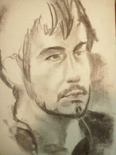
At the end of the figure section of the Class, Sulpy, my Drawing Professor, assigned us an out of class Self Portrait.
There is an obvious likeness but i still believe the proportions of the face are incorrect [not to mention the hideous proportions of the hand] but none the less, I appreciate the final product and the valuable lessoned learned and in turn, experience gained.

Materials:
          100 lb. Drawing Paper
          Charcoal

2D Design: Famous Works

 
Fall 2011
Bill Mathie, my 2 Dimentional Design, assigned the class to borrow the compisition of a well known work of art and then use the components of another 2 pieces of artwork to produce a well composed design.

The Pieces I used for the Composition is obviously 'The Kiss' by Gutauv Klimt but the other two pieces are actually novels; the first being Wuthering Heights by Emily Brontë and the then The Scalet Letter by Nathaniel Hathorne.
The scenes exerted are of when Heathcliff [the Male love interest and antagonist of Wuthering Heights] leaves Catherine [the Female love interest who marries another man for Lifestyle] and she catches the illness from the rain that would kill her and, from The Scarlet Letter, when Hester, an exiled "hartlet" who had another's child whilst her husbandwas presumably dead, confronts her lover and father of her child, the priest Dimmesdale, about their plans for the future fro their daughter and their teetering place in the extremely conservative protestant colony.

Materials: Illustration Board, Acrylic Paint, Paper Back Novels, Copic Markers, Micron Pens

Drawing I: Impromtue Peer Portraiture

 Fall 2011

When the Model doesn't show, Students are expected to jump at the chance for extra credit. No one stood forth so the class participated in short 15 to 20 minute portraits of others in the group; as one would pose, the others would draw, so on and so forth. Andrew, the man to the left, was by far the most popular model: even our professor, Sulpy, participated in his second '15 minutes' of fame.

Materials: 100 lb. Drawing Paper, Charcoal

2D Design: Scale


Fall 2011

 
The Criteria for the project was simply to use scale a means to a goal and I chose to use scale to convy depth the shallow confides of a room with sunflower appolstered chairs and two business people conversing. The scale might also conceptually hold meaning between the two but no specefic idea was in mind.

Materials: Printed Value Paper, Illustration Board

Drawing I: First Models


Fall 2011
My Drawing Professor began figure studies after Mid Terms which I believe was a wser choice than starting with the figure. Potraiture was not as touched upon but it seems to be less important in foudations i suppose.

Materials: 100 lb. Drawing Paper, Charcoal

2D Design: Grid Project


Fall 2011
My 2-Dimensional Design Professor, Bill Mathie, assigned a project which we took an existing design and exicuted the values and shapes using text or textures. Thought the Camera could not capture the minute detailing of the printed design, the text value of the background layer consists of the names John and Jude, both of whick yield almost identical value range when layered to achieve tone.


Materials:

Cold Press Illustration Board
Black Card Stock
Printed Text

Drawing I: Midterm


Fall 2011

This is the piece i did for my Drawing I Midterm taught by Alysandra Sulpy. The criteria was simply to compose a drawing from the communal still life or dead nature as I like to call it she set up for the entire class

Materials:
                Toned Paper
               White & Black Charcoal